Your Mental Map Is Lying to You: The Hidden Geography Shaping Where You Think to Travel
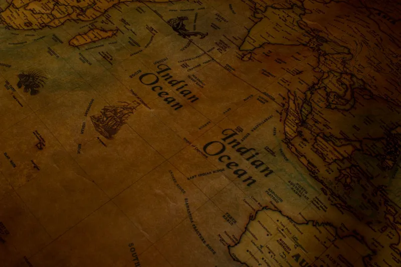
Here's a question worth sitting with for a minute: when you close your eyes and picture a world map, what do you actually see? Europe probably lands somewhere near the center. North America takes up a satisfying chunk of real estate. And somewhere near the bottom, smaller than it has any right to be, sits Africa — a continent that is, in reality, large enough to swallow the United States, China, India, and most of Europe combined.
That mental image you just conjured? It's not neutral. It was handed to you.
The maps we grow up with, learn from in school, and scroll through on our phones aren't just tools for getting from point A to point B. They're editorial decisions baked into geometry — and those decisions have been quietly shaping which destinations feel worth visiting and which ones never quite make it onto your radar.
The Mercator Problem (And Why It Still Matters in 2024)
The Mercator projection was invented in 1569 by a Flemish cartographer named Gerardus Mercator. He designed it for sailors who needed straight lines to navigate ocean routes. It was a practical solution to a specific nautical problem, and it worked beautifully for that purpose.
What it was never meant to do was hang on classroom walls for 450 years and define how billions of people understand the relative size and importance of places on Earth.
But here we are.
The Mercator projection inflates landmasses as they move away from the equator. That's why Greenland looks roughly the same size as Africa on a standard world map, when Africa is actually about 14 times larger. It's why Alaska appears to dwarf Brazil, when Brazil is nearly five times the size. And it's why the regions clustered around the equator — Southeast Asia, Central Africa, Central America, the Pacific Islands — tend to look like afterthoughts, squeezed and minimized in a way that subtly communicates: these places are small, peripheral, less.
For travelers, that visual hierarchy has real consequences. The places that look big feel important. The places that look small get skipped.
How Google Maps Decides What You See
Mercator isn't just a relic of old atlases. Google Maps uses a version of it too — and it adds its own layer of editorial curation on top.
Think about how you actually use Google Maps when you're planning a trip. You type in a city, you zoom in, you start exploring. But what you see when you zoom out — what gets labeled, what gets highlighted, what appears as a suggested destination — is the result of an algorithm making choices about what's worth surfacing.
Popular tourist corridors get dense, legible coverage. Lesser-visited regions get sparse labeling, fewer photos, and almost no suggested highlights. When you zoom into parts of Central Asia, the Horn of Africa, or the interior of Papua New Guinea, the map starts to feel thin. Roads fade out. Towns go unnamed. The implicit message is clear: there's not much here worth finding.
Of course, that's not true. It just means fewer people have fed data into the system — which is a self-reinforcing cycle. Low visibility leads to fewer visitors, which leads to less user-generated content, which leads to continued low visibility.
The Regions Falling Through the Cracks
So which destinations are getting systematically filtered out of the average American traveler's mental map? A few worth naming:
Central Asia — Kazakhstan, Kyrgyzstan, Tajikistan, Uzbekistan, and Turkmenistan together form a region of staggering landscape diversity and genuinely ancient Silk Road culture. Uzbekistan alone has cities — Samarkand, Bukhara — that rival anything in Western Europe for historical weight. But because the region sits in a cartographic no-man's-land between Russia and China, it rarely shows up in travel feeds or algorithmic recommendations.
West Africa — Most Americans who travel to Africa head to East Africa for safaris or South Africa for its well-worn tourist infrastructure. West Africa — Senegal, Ghana, Benin, Togo — offers a completely different experience: vibrant music scenes, deep histories connected to the African diaspora, and some of the most genuinely welcoming cultures on the continent. It's not underdeveloped as a destination; it's just undersurfaced.
The Pacific Islands beyond Hawaii — Palau, Vanuatu, the Federated States of Micronesia. These places barely register on the average American's mental map, partly because they're so tiny on a Mercator projection that they're often just dots, and partly because Google's coverage thins out dramatically once you leave the main tourist trails.
The Balkans interior — Everyone's heard of Croatia's coast by now. But North Macedonia, Albania's mountain regions, and Kosovo remain genuinely off the radar for most US travelers, even as they offer medieval architecture, dramatic landscapes, and a fraction of the crowds you'd find in more algorithmically-favored European destinations.
How to Intentionally Reframe Your Exploration
The good news is that once you understand how your mental map got built, you can start dismantling it on purpose. A few approaches that actually work:
Switch your map projection. Seriously — look up the AuthaGraph or Winkel Tripel projection and spend some time with it. Seeing the world rendered differently, even once, does something to how you think about scale and geography. Africa suddenly looks like what it is: enormous. The Pacific Ocean stops being a blue void and becomes a region worth thinking about.
Start with a region, not a city. Most of us plan trips by thinking of a city first — Paris, Tokyo, Lisbon. Try flipping that. Pick a region you've never seriously considered, learn its rough geography, and then figure out which city or town might be the right entry point. You'll end up somewhere more interesting almost every time.
Use WonderMap's region-first browsing. Rather than searching by destination name (which rewards already-famous places), browse by geographic region and let yourself linger in places you don't recognize. That unfamiliarity isn't a warning sign — it's the whole point.
Follow cartographic curiosity, not the algorithm. When you're scrolling a map and something looks geographically interesting — a coastline, a mountain range, a river delta — stop and look it up, even if the map isn't giving you much to go on. The thinness of the coverage is often inversely related to how genuinely undiscovered the place is.
The Map Is Not the Territory
There's an old idea in philosophy and linguistics that the map is never the territory — that any representation of a place is just that, a representation, shaped by the choices of whoever made it.
For travelers, that's not just an abstract idea. It's a practical reminder that the tools you're using to discover the world are also, quietly, limiting it. The Mercator projection made sense for 16th-century sailors. Google Maps' algorithm makes sense for optimizing ad revenue. Neither was designed with your curiosity in mind.
WonderMap exists because we think the world is bigger and stranger and more rewarding than any single projection can capture. The hidden gems aren't just towns you haven't heard of — sometimes they're entire regions that got cropped out of your mental map before you ever had a chance to wonder about them.
The first step to finding them is realizing the map you've been using isn't showing you everything. It never was.